Showing posts with label review. Show all posts

Wednesday, 14 August 2013

Intelligence chief Clapper to set up US surveillance review group


The administration of U.S. President Barack Obama on Monday launched a review of whether the country uses optimally advancements in technology to protect its national security while preventing unauthorized disclosure and maintaining public trust.

Surveillance by the U.S. National Security Agency has been at the center of a privacy controversy after its former contractor, Edward Snowden, released in June certain documents that suggested large scale collection of phone metadata and information from the Internet by the agency.

Director of National Intelligence James R. Clapper has been directed to form the new Review Group on Intelligence and Communications Technologies, which is to brief Obama on its interim findings within 60 days of the establishment of the group. A final report and recommendations are to be submitted through Clapper to the president no later than Dec. 15.

The constitution of the body including the number of members it will have was not disclosed.

The review group "will assess whether, in light of advancements in communications technologies, the United States employs its technical collection capabilities in a manner that optimally protects our national security and advances our foreign policy while appropriately accounting for other policy considerations, such as the risk of unauthorized disclosure and our need to maintain the public trust," according to a memorandum on the White House website.

Obama said Friday that his administration will appoint an independent board to review the country's surveillance programs, and also add a privacy advocate to defend privacy in the Foreign Intelligence Surveillance Court when agencies ask the court for new surveillance orders. Obama also said he will work with the U.S. Congress to limit data collection by the NSA under the Patriot Act.

The U.S. National Security Agency "touches" about 1.6 percent of daily Internet traffic, of which only 0.025 percent is selected for review, the agency said in its defense in a brief on Friday.

Citing figures from an unnamed tech provider, the NSA said the Internet carries 1,826 petabytes of information per day, of which the agency's analysts in effect look at 0.00004 percent or "less than one part in a million." The agency said its total collection added up to an area smaller than a dime in the standard basketball court of global communications.

U.S. telecommunications providers are compelled by court order to provide NSA with metadata about telephone calls to, from or within the country, NSA said in the brief. The purpose of the collection, under the NSA's Business Records FISA program, is to identify the "U.S. nexus of a foreign terrorist threat to the homeland." But the government "cannot conduct substantive queries of the bulk records for any purpose other than counterterrorism," it added.

NSA said it is authorized under section 702 of the Foreign Intelligence Surveillance Act to target non-U.S. persons who are reasonably believed to be located outside the U.S. The controversial part, criticized by many rights groups, is that the communications of U.S. persons are sometimes incidentally acquired in targeting the foreign entities.

In those cases, approved minimization procedures, which control the acquisition, retention, and dissemination of any information of a U.S. person, are used to protect the privacy of that person, NSA said.

"We do not need to sacrifice civil liberties for the sake of national security; both are integral to who we are as Americans," the unsigned document stated.

Verify people online. Backgroud checks, Criminal Histories, Marriage Records plus more. One Billion Records. Click Here

Tuesday, 6 August 2013

Review: Digital Storm's Virtue delivers superior power in a midsize tower

Digital Storm Virtue $2,199.00 Powerful components and room to grow make the Virtue a great gaming desktop if the price tag doesn't manage to scare you away.

What’s in a name? HP goes for an emotion to describe its high-end computers: Envy. Acer conjures aggressiveness for its gaming PCs: Predator. And Dell uses a spelling-challenged acronym for its best PCs: XPS (Xtreme Performance System). What concept does Digital Storm seek to conjure with its pricey ($2200) Virtue midtower gaming rig—moral superiority?

The company’s actual goal isn’t quite that lofty. “We noticed there are not many PC manufacturers designing mid-tower gaming systems with the same ardor and attention that ultra-tower PCs receive,” Digital Storm’s director of product development, Rajeev Kuruppu, said when the Virtue was announced. “As its name suggests, Virtue represents a higher standard of PC gaming, both in terms of aesthetics and performance.”

Robert Cardin"Modest" might have been a better name for this PC, given its unassuming enclosure. 
To reach that standard, Digital Storm packed an unlocked Intel Core i7-4770K CPU from Intel’s new Haswell family of processors, 16GB of DDR3-1600 memory, and Nvidia’s GeForce GTX 780 discrete graphics card into a compact steel-and-brushed-aluminum case. (The Virtue also comes with Windows 8.) The result is a compact gaming rig that delivered a very respectable Desktop WorldBench 8.1 score of 399. It fell just short of the cheaper Micro Express MicroFlex 47B’s score of 421, though the latter is a full-size tower and has a more powerful video card. Why? While neither manufacturer elected to overclock its system, Micro Express splurged with a 512GB SSD where Digital Storm provides just a 120GB SSD. As a result, the MicroFlex performed much better on our productivity benchmarks.


The Virtue looks much more interesting on the inside.
On the gaming front, the Virtue bested the MicroFlex 47B on both our synthetic and real-world benchmarks, delivering a 3DMark Cloud Gate score of 26214 versus the MicroFlex's 24864 at a resolution of 1920 by 1080 pixels. With real games and visual quality set to Ultra, the Virtue just missed reaching the coveted 60-frames-per-second mark with Dirt Showdown at 2560-by-1600-pixel resolution (it hit 57.3 fps, versus the MicroFlex 47B’s 41.4 fps). The same goes for BioShock Infinite at those settings: Digital Storm’s system reached an impressive 55.4 fps compared with the Micro Express tower’s frame rate of 46.9.


The Virtue can accommodate a second two-slot video card, but not more.
If you’re considering a midtower system, you probably don’t want a plus-size PC sucking up a lot of floor or desktop space. And if you want something small, you probably expect it to be quiet, too. Digital Storm accomplishes that goal in part with a Corsair H100i liquid-cooling system that consists of a CPU water block and a 240mm radiator mounted to the top of the case. This machine won’t keep you up at night or interfere with movie-watching or music-listening sessions.

Despite its smaller case dimensions (17.7 inches high by 17.7 inches long by 8.3 inches wide), the Virtue has plenty of room for expansion inside. If you want higher frame rates with games, throw in a second graphics card (you can configure the Asus Gryphon Z87 micro ATX motherboard to operate with one x16 PCIe 3.0 slot or two x8 PCIe 3.0 slots, and it supports both Nvidia’s SLI and AMD’s CrossFire multi-GPU standards). The system’s 1050-watt power supply, Corsair’s Pro Series HX1050, provides more than enough juice to support such a configuration.

Our test Virtue came with a 1TB, 7200-rpm WD Caviar Black hard drive in addition to a 120GB Corsair Neutron GTX SSD, leaving room for one additional 3.5-inch drive and three more SSDs. A Blu-ray player/DVD burner resides in one of the 5.25-inch drive bays (the second bay is mostly blocked by the radiator mounted on the top of the case).

Two USB 3.0 ports as well as microphone and headphone jacks are conveniently located on the front of the machine. Four additional USB 3.0 ports, four USB 2.0 ports, gigabit ethernet, S/PDIF out, and the usual analog audio ports are around back. The video card’s mounting bracket has ports (one each) for dual-link DVI, single-link DVI, HDMI, and DisplayPort.

The Virtue is jam-packed with quality components that enable it to deliver the performance of machines twice its physical size. Its dimensions and motherboard won’t let you go beyond two video cards, but it delivers solid performance on today’s games with the one card it has now. Gamers will love the Virtue, even if their wallets won't.

Friday, 2 August 2013

Review: Start Menu Reviver gives Windows 8 a modern UI-style Start Menu

How you'll like Start Menu Reviver largely depends on what you want out of a Windows 8 Start Menu. If you want something that mimics the Windows 7 Start Menu exactly, you're better off with Stardock's Start8 or Iobit's Start Menu 8. If you want something that's more of a melding of Windows 8 and a start menu, Start Menu Reviver might be what you seek.


By default, Start Menu Reviver looks like an Ease of Access application for the sight-challenged, but you can reduce it to a normal size.
When you first install Start Menu Reviver, it defaults to its large size. It's handy for touchscreens, but on a monitor or laptop screen, it looks like an Ease of Access feature for the eyesight-challenged. You can select a size that is more in keeping with the aspect ratios employed throughout the desktop. Start Menu Reviver sits on the task bar approximately where you'd expect to find it, but a little to the right. As with other Start Menus for Windows 8, you can change the icon to suit your taste.

In a column on the left of Start Menu Reviver resides a list of common Windows programs (desktop and modern UI) such as Task Manager (modern UI version), Network (desktop), Run (desktop), and the user name (which actually takes you to User Account Control rather than the user folder the way that most Start menus do). To the right are My Computer, Internet Explorer (desktop), a link for the modern UI, and a bunch of other tiles representing both legacy and modern UI apps. You can freely arrange—and even resize—the tiles, just as with the Modern UI.


Start Menu Reviver's tiled UI fits well in the Win8 modern UI.
Start Menu Reviver has the usual search box at the bottom. However, this is where I first noticed that there's no tabbing between fields or sections as there is in a normal Start Menu. It can be considerably faster navigating when you can use both the mouse and the keyboard. Not everyone is touch-oriented yet.

Start Menu Reviver lacks the fine control over switching between the desktop and modern UI that the competition offers. You can have the Windows Key invoke Reviver rather than the modern UI, but that's about it. Start8 and Start Menu 8 both allow you to take the modern UI out of the mix entirely.

Start Menu Reviver is free, and it's nice that Windows 8 users have another choice when it comes to putting back the Start Menu that Microsoft so thoughtfully decided you no longer need. It's not my top choice, but not everyone works the same. Give it a spin along with the others and share your opinion.

Thursday, 25 July 2013

Review: Prime World: Defenders an enjoyable tower-defense game for Mac

Editor’s Note: The following article is reprinted from Macworld UK. Visit Macworld UK’s blog page for the latest Mac news from across the Atlantic.

Prime World: Defenders is enjoyable fun, and if you ramp the speed settings up it can get pretty frantic at times. The game takes the tried-and-trusted tower defense formula and mixes it with elements of a collectible card game.

The storyline is pretty flimsy; a mysterious substance called Prime can be used both to develop new technologies and to power magical spells. Prime is concentrated in an area called the Prime Zone that is also populated by goblin-like baddies called The Touched, so it’s your job to build defensive towers and lob in the occasional magical spell to keep the baddies at bay while you harvest as much Prime as you can. However, building towers and using magic also uses up Prime, so the winning strategy lies in building strong defenses while still hanging on to enough Prime to complete each mission.


Nival
The game’s 3D graphics are neatly designed and colorful and remind me quite a bit of WarCraft, and the various levels are spread across a variety of different landscapes to keep things fresh. At the start of the game you’re equipped with just a couple of basic towers and a single magical spell, and the first mission acts as a tutorial that shows you how everything works and helps to get you started.   As you complete missions and collect Prime you’ll gain cards that give you access to new types of towers that do more damage, perhaps hurling poison at your enemies or sticky goo that slows them down and makes it easier to pick them off. You can also learn a small number of powerful spells that can affect multiple enemies all at once, but these spells use up a lot of Prime and take a long time to recharge, so you can only use them as a last ditch defence.

The basic mechanics of the game are simple enough, and Prime World Defenders is certainly suitable for young children. However, you can only hold a few cards in your deck at a time, so you do need to think carefully about the cards you want to use at the start of each mission. Adults who want more of a challenge can also increase the speed of the game so that the waves of enemies come swarming onto the screen more quickly and really force you to think on your feet.


Nival
Prime World Defenders is good fun for both adults and younger players, but it feels like the sort of casual game that would work better sitting on the sofa with an iPad rather than sitting at a desk in front of your Mac. It could be a hit on the iPad, but it’s not an essential purchase for the Mac (it require use of the Steam online gaming service) unless you’re a really avid fan of tower-defense games.

Review: Cintiq 13HD is a lovely small-screen addition to your workspace

Wacom Cintiq 13HD $999.00 At $999, the Cintiq 13HD is a wonderful small-screen tablet display and an easy purchase. It’s held back only by its lack of Multi-Touch.

As an on-again, off-again graphic designer and doodler, I’ve long lusted after Wacom’s Cintiq line. My very first Wacom product, an Intuos, sparked my dreams: How amazing would it be if I could not only draw with pressure sensitivity, but see my digital canvas as I sketched? But Cintiqs in the early 2000s were far too pricy for a day-dreaming high schooler, and I had to make do with my (still perfectly useful) Intuos.

Had the Cintiq 13HD been around when I was learning to do digital inks, however, I would have blown my savings in an instant. Not only is the pressure-sensitive tablet display compact enough that it doesn’t require getting another desk on which to use it, but it’s incredibly inexpensive for a Cintiq—just $999. I realized that at first glance, $1 less than a thousand doesn’t seem particularly price-conscious—until you consider the $2499 and $3699 price tags on the 13HD’s bigger siblings.


Being able to see what you're working on has always been one of the Cintiq's great strengths.
It has many of the same features, benefits, and build quality as those more-expensive tablet displays, including a 178-degree viewing angle, 2048 levels of pressure sensitivity, and a 1080p HD screen, but in a smaller package—the screen size is 13.3 inches diagonally compared with the 22HD’s 21.5 inches. Measure it up against another recent Wacom product, the Intuos5, and you’ll find it has almost the same footprint as the medium version of the company’s drawing tablet. Add that to the 13HD’s weight—just 2.65 pounds—and the display is practically portable.


The Cintiq 13HD's cords are much more slimly packaged than its predecessor, but they still keep it from being truly portable.
I say practically because the Cintiq still has one major limitation—unlike Wacom’s display-less tablets, it needs a power outlet to function. The cord that connects the 13HD to both power outlet and computer looks much like Apple’s 30-pin dock connector: It snaps into the Cintiq on one side, with multiple cables trailing from that—one to connect the display via HDMI, one for USB, and one that leads to the (fairly small) power brick. (Gone is the 12WX’s breakout box, thank goodness—these new cords are much sleeker.) Given that no Mac currently offers an HDMI port, you’ll also need an HDMI-to-Thunderbolt cable if you want to hook up the 13HD to your iMac or a non-Retina portable Mac.

I had hoped that despite this excess cordage the 13HD would still be relatively moveable, but beyond its viewing stand, that doesn’t seem to be the case. When I moved the Wacom from its stand to my lap, the slight jostling of the cable made my iMac lose the 13HD’s connection; the only cure was fully unplugging and replugging in the dock connector to the Cintiq. Granted, Wacom's Cintiq line isn't really designed to be constantly moved, but the small form factor makes me want to turn and twist it like I might a sketchbook or an iPad.

If you don’t plan to move the 13HD during drawing beyond its stand, however, it should serve you very well. I had only an instance or two of the stand slipping away from the tablet, and that was mostly due to improper seating—in order to properly seat the 13HD in the stand, you need to line up the stand with a small slot in the tablet’s back. And it’s an excellent tablet for traveling artists—just so long as your actual art allows you to be stationary with your tablet. I like the 13HD much better than the previous small-screen Cintiq, the 12WX.


The 13HD sports the same lovely overlay HUD for its buttons as the Intuos5.
The actual drawing process is as lovely as I always imagined it would be on a Cintiq. It has the same comfortable stylus as the Intuos line, and there really is no substitute to being able to draw directly on your surface (even if that surface is digital). I did have to break a few habits I picked up from drawing on the iPad: namely, the weird “don’t let your palm touch the screen” claw formation I would contort my drawing hand into, but also any stray Multi-Touch gestures.

In fact, the lack of touch-sensitivity is the one major disappointment I have with this entry from Wacom. Almost every tablet in the Wacom line now has Multi-Touch support, but the 13HD was introduced as a screen only. While this was perhaps to keep its price at that magic $999 number, I think it hurts the device overall: We’ve gotten so trained at this point to interact with our screens that to limit it to just stylus and button input makes the 13HD seem crippled in a way. I can’t tell you how many times I tried to pinch-to-zoom my canvas or tap on a window before I realized, sadly, that it just wouldn’t work.

The 13HD’s button and HUD interface certainly isn’t bad; it has all the same bells and whistles as Wacom’s other tablets, allowing you to map buttons to your liking through a System Preferences widget. The display toggle HUD is also nice, offering a slew of additional user-configurable options. But these features together can’t quite replace the pleasure of a touch interface.

At $999, the Cintiq 13HD is a wonderful small-screen tablet display and an easy purchase. It has the same great display and excellent pressure-sensitivity controls as its larger siblings at a fraction of the price, while maintaining solid build quality. If you want something a little more portable and need Multi-Touch support, however, it may not be the tool for you.

Review: Create your own audible biography with StoryPress for iPad

If you’ve ever had a hankerin’ to sit down and craft your own biography—or to collect the stories of your parents or grandparents before they pass on—StoryPress, a free iPad app from GhostGear Labs, is just the place to start. It helps you record oral histories that sound nearly as polished and professional as the Story Corps pieces you sometimes hear on NPR.

After you log in with an email address or your Facebook account, StoryPress wants you to jump right into the creative process. You’ll enter your name, the year of your birth, and then create a cover for your first book. (Despite the conceit that you’re creating a book in StoryPress, there’s very little text involved: You’ll be recording your memories, not typing them out.) The cover includes the title, an icon from a list provided by StoryPress, and a photo from your iPad library.

Your next prompt is to select a method to record your tale. Select “Dictation” if you already know precisely the story you want to tell—just tap a button in the app and start recording while you talk. Most of us, though, will want to use the second option—“Interview Me”—which gives you a choice of more than a dozen categories, each featuring an interview template of roughly a dozen questions or more.


Don't know where to start with your bio? StoryPress will interview you. I chose the “Childhood” category, which offered nearly two-dozen questions. The questions—and, often, a few secondary questions—appear on the screen. You push a button to begin recording and answer the question, or can skip the question entirely if you don’t like. Depending on how much of a storyteller you are, this can be an arduous process: Luckily, there’s an option to pause the questioning and come back later, which is particularly useful if you want to get down into detail.

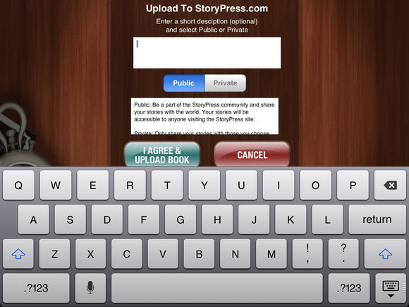
Once done, you’ll upload the finished book to StoryPress.com, choosing to do so either in private or public mode. Both modes let you share your story with friends and family via Twitter, Facebook, or email—friends are directed to StoryPress’s website to listen. If you save a story publically, it becomes part of StoryPress’s social network of folks who trade stories about the good old days.


Both public and private modes let you share your story with friends, but public makes it available to the StoryPress community. StoryPress allows you to create and upload five books for free. After that, you’ll have to pay $49 a year for a premium account to create and store more of your oral histories. Be warned: It’s easy to run quickly through those first five credits. (I accidentally used two on the same book, uploading it first in private mode and then in public mode. Oops.)

Users would definitely benefit from a little more in-app guidance about how to use the complete StoryPress service. Upon first use, I uploaded my book in “private” mode, then couldn’t figure out how to share it with friends until I went to StoryPress’s website. (You can, however, go to the website within the app.)

This is a good app. It is easy to use, and has crystal clear recording—but there are some items on my wish list for future editions of StoryPress. Oral histories can be rich, but it would nicer if there were more visual elements at play: The ability to add more photos of an event being described, at the very least, or perhaps the ability record video interviews. 

Wednesday, 24 July 2013

Review: Brother's HL-3170CDW color laser-class printer is inexpensive, but graphics are mediocre

You want a color laser printer, but you don't have a lot of cash. How does $280 sound? That’s the price of the Brother HL-3170CDW, and in exchange it delivers reasonably good prints. Not pristine, evocative color graphics—move on to another printer for that. But good text and decent spot color, it can do, and the toner costs are tolerable as well.

Here’s the real decision: Do you pick this all-around-average machine, or do you pick this other, like-priced color laser, the Dell C1760nw, which has much better color quality—but also much more expensive toner? Or do you think a bit outside of the box and consider a business inkjet, such as the Epson WorkForce WP-4020, which competes head-to-head with both of these lasers on speed, print quality, and features, and whomps them both on cost of consumables? By our reckoning the latter is the best deal, but some people just can’t get laser out of their heads, and they will have to think harder about the tradeoffs.

Measuring 16.1 inches wide by 18.3 inches deep by 9.4 inches wide and weighing 39 pounds, the HL-3170CDW is fairly large and beefy for an entry-level, laser-class printer (it uses LED technology to produce basically identical results). The height is due more to the stacked toner/drum system than the bottom-mounted, 250-sheet paper cassette. There's also a 100-sheet output tray integrated into the top of the unit, and a single-sheet manual feed for envelopes and glossy photo paper. The unit prints automatically in duplex.

When some color printers run low on one color, they will complain, but keep printing. Not so with the HL-3170CDW: It will not print when you run out of any of the four colors. This can be a problem if you really, really need to print something and haven't any spare toner. Better a warning and a less-than-optimal printout, than no printout at all. Brother needs to rethink this.

There's no reason to make a big deal about control panels on single-function printers, as most people rarely use them after setup is over. (Multifunctions are another story.) But the HL-3170CDW's control panel could definitely use a dedicated menu button. Employing the OK button for this purpose is unintuitive and awkward, an unnecessary corner cut. Otherwise, the single-line monochrome LCD display and controls are easy enough. The HL-3170CDW's setup was a breeze. The unit sports USB, ethernet, and Wi-Fi connectivity. There's a full array of wireless and email printing features, including AirPrint, and both the PC and Mac driver dialogs offer a bevy of options.

After enjoying its initial purchase price, your ongoing costs for the HL-3170CDW will be, if not actually cheap, at least better than expected. Most low-cost color lasers hit you with high toner costs down the road. The HL-3170CDW’s prices hover comfortably around the average—and are better than those of many of its competitors, though not as good as the above-mentioned Epson WorkForce WF-4020, whose inks are amazingly cheap. The unit ships with starter cartridges rated for a scant 1000 pages. Brother’s price for the standard-size, 2500-page black is $85, or a midrange 3.4 cents per page (cpp). We found it online for closer to $70, or 2.8 cpp.

The standard-size, 1400-page cyan, magenta, and yellow supplies cost about $70 apiece per Brother—a middling 5 cents per color, per page. Our shopping found prices closer to $57 apiece, or just over 4 cents per color, per page. A page with all four colors (using the lower prices) would cost about 15 cents. Higher-capacity, 2200-page color cartridges are available, but they offer just a small savings in cost per page over their standard-size cousins.

Speed is good compared to other entry-level color lasers and business inkjets. The Brother HL-3170CDW spits out text and mixed monochrome pages at a lively 12.2 ppm on the PC and 11.2 ppm on the Mac. Snapshot-sized (4-inch by 6-inch) color photos printed onto letter-size paper at a brisk pace of 2.9 ppm, and full-page photos arrive at a spirited 1.4 ppm.

Fast means nothing if quality is inferior, and unfortunately, that describes the HL-3170CDW's graphics. Both monochrome and color artwork exhibited mild horizontal striations and vertical banding that were visible under light scrutiny. Worse, the color palette is overly light, and human faces look jaundiced. For a dab of color, a small picture, or the occasional, simple graphic, the HL-3170CDW's color quality will suffice, but not for much else. On the other hand, text is top-notch, and that's generally the larger part of the equation for the small or home offices that would consider this model.

To its credit, Brother offers a little more than most competitors do. The warranty lasts only one year, but there's free phone support for as long as you own the product. Speed is excellent, and for text and spot color the HL-3170CDW's print quality is fine. Toner costs are around average. At this price point, it offers a decent color-laser experience without gouging you later. But if you want the best possible deal in this price range, a business inkjet delivers far more.

Tuesday, 23 July 2013

Review: Generate better-looking Windows 8 start tiles with OblyTile

One of the biggest selling points of Windows 8 is the tiled start page, which looks pretty and enticing to use. But one of the drawbacks of that page is that, when you install a third-party program (i.e. something not from the Windows App Store), that program's start tile usually comes out looking like a mess. Small portable app OblyTile lets you generate better-looking tiles and make the start page a pleasure to look at again. And if you hate tiles, you may like what OblyTile can do for your standard desktop, too.


Upon opening the app, you can view the manager that shows your list of installed apps. Just choose the one you want to install the tile for.
  The reason why a third-party tile looks strange is because it pulls the default logo from the program's installation folder. Most of these logos aren't optimized for the Windows 8 tile menu. They may be too small, too low-definition, or both. The key is to get a logo or icon big enough and high-def enough to stand on the tiled start page.

Although OblyTile will generate new tiles for you, it doesn't actually supply the icons. I recommend websites such as the Icon Archive, where you can download high-quality icons for free.


Alternatively, you can choose a file, a folder, or a website URL and enter the path of the program or website manually.
  OblyTile doesn't require installation. Once you're in the program, you can either manually search for the desired program on your PC or open up the Manager on the right-hand side, which generates a list of your installed programs. The Manager can also make a list of your current program shortcuts and offer you the ability to convert those shortcuts into tiles.

OblyTile's interface is very straightforward. If you go the manual route, enter in all the details, navigate to both the installed folder and the icon on your PC, choose your background color and title text color, then click "create tile."  Your old tile on your Windows 8 start page will then be deleted and in its place the new tile will be inserted.

The tiny old Angry Birds icon is on the left, and the bolder new one is on the right. You can also, if you want, have shortcuts to Windows 8 apps (such as Mail, Skydrive, Bing, and so on) put on your desktop, and OblyTile will use the default Windows 8 icon. This is especially useful for people who want to use these services but hate the whole tiled start page concept.

This app is really something that Microsoft should be offering users by default, if they want users to be using the tiled start page extensively. Half an hour with OblyTile transformed my Start tiles into something more visually appealing and as a result, I am now more likely to use it. Are you listening

Friday, 19 July 2013

Review: Convert video to many formats with Sorenson Squeeze 9

If you're looking for a video transcoding product to compress your vacation vids, look to something other than the ultra-competent, but extremely pricey Sorenson Squeeze 9. If however, you're a busy professional who needs to produce video in a variety of formats in the shortest possible time, Squeeze is what you're looking for.  It's a fast, comprehensive, extensible, and highly configurable transcoder. The client program comes in three flavors: a $799 standard version, a $999 pro version, and a $2000 server version.

Sorenson Squeeze 9's interface sports a host of minor improvements and some color to break things up, but it didn't need a lot of help in the first place. Here you see the side-by-side preview with a B&W filter engaged on the left.
  New to Squeeze 9 are support for HTML 5, an improved video preview window with side-by-side preview, a slightly improved interface…and more speed. The company claims three- to six-fold improvements, depending on the output codecs involved—and Squeeze supports a lot of those—from Main Concepts h.264 to Ogg Theora, and just about everything in-between. Also new is pre- and post-roll video for advertising headers or tags. Closed captioning support now includes EIA-608 or EIA-708 and Quicktime timecode is now passed through. The Adobe Premiere plug-in has also been updated.
Using Squeeze is a breeze. Simply open or drag  the files you want to convert to the main window, select an output template, do the same with any FX or corrective filters you wish to apply, then click on the Squeeze It! button. Sorenson Media maintains an online library where you can grab more presets. You may of course also choose individual video and audio codecs and tweak individual settings such as bit rates, resolution, etc. on your own.

Squeeze 9 supports nVidia CUDA GPU acceleration, but not AMD APP or Intel's Quick Sync. However, it will now take advantage of all the cores in your CPU. With the four physical and four virtual cores in my Core i7-3770 test bed, that meant very, very good performance. That meant transcoding a two-hour DVD to h.264 and aac in the background in about half an hour. Despite the heavy CPU usage, the rest of Windows 7 was still quite responsive.

Despite the heavy CPU usage, Squeeze plays nice with your other programs. There was no noticeable slowdown in my Core i7-3770 test bed.
  The transcoding results with Sorenson, thanks to top-flight codecs, are nothing short of excellent, and the filters—such as black and white, sepia, auto crop deinterlace, etc.—produce very good results.  Squeeze also supports VST plug-ins for audio.

If you're a pro who does lots of encoding, Squeeze 9 is absolutely worth the price. The encoding is as good and fast as it gets. That said, it's an investment and casual users are better off with a free program such as Freemake Video Converter or Any Video Converter. 

Review: OmniPage 18 Standard has great OCR and page reconstruction

OmniPage 18 Standard ($150) equals Acrobat XI at outputting Word files and editable PDFs, and it also does a very good job of extracting pure text. By default, it's a tad aggressive at rotating images trying to find text to extract. However, you can disable this behavior in the settings dialog.

OmniPage features the side-by-side comparison editing of all types of files that Acrobat's lacks, and its interface is bit more flexible than Abbyy FineReader's, allowing you to arrange the various panes in more ways. OmniPage, like Acrobat, also provides a batch manager for automating multiple jobs.


By default, Omnipage 18 Standard is a tad aggressive about rotating images. But you can turn this behavior off, and it did a bang-up job making an editable version of my high-school yearbook.

OmniPage 19 Ultimate is the real news for this industry stalwart. The new $500 Ultimate marries OCR with company's speech-to-text and text-to-speech technologies from Dragon NaturallySpeaking, and starts a transition to a Windows 8-style interface. Though those aren't strictly OCR features, it does mean the program is morphing into a jack-of-all-trades translation tool. 

Dell XPS 27 Touch review: Looks are everything


Dell XPS 27 Touch $2,099.00 While we have a few minor quibbles with the Dell XPS 27 Touch's design, we think this is the best all-in-one on the market today.
 
When it comes to its high-end all-in-one PC lineup, Dell seems to be operating on the “if it ain’t broke, don’t fix it” principle. The XPS 27 Touch packs a speedy new Haswell CPU under its hood, but that’s the only significant departure from earlier models.

Our review unit, which costs $2100 as of July 17, 2013, sports a quad-core Intel Core i7-4770S processor; 8GB of DDR3/1600 memory; a discrete video card (Nvidia’s GeForce GT 750M); and a roomy 2TB, 7200 rpm hard drive augmented by a 32GB mSATA SSD cache. That’s impressive for any all-in-one, and it helped the XPS 27 Touch deliver a Desktop Worldbench 8.1 score of 262, which means it’s more than two and a half times faster than our reference PC, Acer’s Aspire U. It’s also significantly faster than Vizio’s CA27T-B1. The displays on both of those models are limited to 1920 by 1080 pixels, but they’re also considerably less expensive (selling for $1000 and $1550 respectively).


The Dell XPS 27 Touch produced a high Desktop Worldbench 8.1 score (for an all-in-one, that is). Nevertheless, the Dell’s score places the XPS 27 Touch solidly in the upper half of all the desktop systems we’ve tested so far, although it’s nowhere near the custom-built gaming rigs we’ve evaluated (Primordial Computer’s over-the-top, quad-Titan Medusa hit 385, while Micro Express’s single-GPU MicroFlex 47B scored 421). Unlike most all-in-ones, however, the XPS 27 will satisfy the gamers in your family—as long as their expectations aren’t too hardcore. In our Dirt Showdown, with the game’s resolution at 1024 by 768 pixels and image quality set to low, the XPS 27 delivered a strong 125.7 frames per second. Compare that to our reference PC, which relies on the integrated GPU in its Intel Core i5 3230M processor: It delivered Dirt Showdown at just 47.5 fps.


The XPS 27 Touch is a very reasonable gaming PC, provided you’re willing to compromise on resolution and image quality.

  As befits a new AIO of the Windows 8 era, the XPS 27 is outfitted with a 10-point touchscreen display (this was an optional feature on previous models). Dell boasts that it’s the company’s “brightest and most versatile touch display” to date. I agree, it’s the best touchscreen I’ve seen from Dell. It’s extremely bright, and images and text look fantastically crisp and clear thanks to its 2560-by-1440 resolution. Multitouch gestures are smooth and easy to perform, and the bezel-less design makes using Windows 8 a breeze. But the display is not perfect. I have the same minor complaint about this screen as I had about Dell’s earlier XPS One 2710: Colors, especially skin tones, have a tendency to look oversaturated.


ROBERT CARDINThe dual-articulated hinge enables you to adjust the display’s height as well as its angle. Dell’s XPS 27 Touch is a nice, attractive system, but I do wish the company had paid a little less attention to looks and a little more to usability. This AIO is super pretty, and the changes I want would probably make it a little less so. While the media card reader and two USB 3.0 ports are conveniently located on the left side of the bezel, the HDMI ports (in and out), Thunderbolt/Mini DisplayPort, gigabit ethernet, and four additional USB 3.0 ports on the back of the display are obscured by the stand and are difficult to reach.
ROBERT CARDINMany of the XPS 27 Touch’s I/O ports are obscured by the double-articulated stand (which enables you to adjust the height as well as the angle of the display).


  I’m also not a fan of the four touch-sensitive buttons on the lower left corner on the front of the display. A proximity sensor causes these unlabeled buttons to light up when you hover your finger over them, although the only one you might use on a regular basis is the Eject button for the DVD burner. And speaking of optical drives, if you want a Blu-ray/DVD combo, you’ll need to move up to the $2600 model, which also comes with 16GB of memory and Windows 8 Pro. But if you get your movie fix via Internet streaming, you won’t care.

Aside from those quibbles, the Dell XPS 27 Touch is an exquisite all-in-one.  

Lenovo ThinkPad T431s review: A high-priced Ultrabook without the high-end specs

LENOVO, INC. ThinkPad T431s $1,209.00 Lenovo's pricey new entry into the Ultrabook market caters deftly to business users, but it fails to deliver most of what's good about Ultrabooks: speed, portability, and convenience.


Lenovo’s long-standing tradition of producing black, boxy, boring laptops continues with the ThinkPad T431s, and it’s a testament to their underlying quality that businesses and business users continue to embrace them. But the company might want to rethink the “Ultrabook” suffix tacked onto this one's name, which conjures images of sleek, sexy, and speedy machines. The T431s is none of those things.

Rather, it has the heft and bulk of a more traditional laptop, weighing 3.6 pounds and measuring 0.8 inch thick. One suspects Lenovo could have squeezed in an optical drive, though at least the system leverages its large chassis to pack in plenty of expansion options: ethernet and VGA ports, a Mini DisplayPort, a 4-in-1 memory card reader, and a Smart Card reader for organizations that still rely on them. It also has a fingerprint reader, another nice security-minded perk. The system has only two USB 3.0 ports (three would be better), but one of them is powered so you can charge a mobile device even when the ThinkPad is off.

Thursday, 18 July 2013

Review: Nextly brings together the best of RSS, social networks, and Web browsing

Google Reader is dead. It changed forever the way we read our news, and it's gone for good, leaving the arena open for other players to attempt the same feats. Nextly, an innovative reading app based on streams, takes regular RSS feeds, strips them of everything that's annoying about the format, and provides a new reading experience that combines RSS with regular website browsing and social-network surfing.
Nextly turns any webpage or feed into a stream you can easily browse through.
To personalize the experience further, sign into Nextly using Facebook or Twitter. This will give you access to the My Collection and Favorites features, but will also enable Nextly's social Web browsing. Let's say you connected Nextly with your Twitter account; you can now use Nextly's stream to browse your Twitter feed and lists, automatically accessing all tweeted links as full articles. In other words, your Twitter (or Facebook) feed will be miraculously transformed into an easy-to-browse stream, complete with reply, retweet, and other sharing options.

This is all great, you might be thinking, but browsing single feeds doesn't sound too exciting in a post-Google-Reader, Feedly-inspired world. This is where Favorites come in. Once signed in, you can add any stream (or website) to your favorites, which then acts as a regular RSS reader for all intents and purposes.
Bookmark any webpage to your collection, or share it using a unique link.
All your favorite websites are listed under the Favorites tab, and while you can't sort these into folders like you can in other readers, Nextly makes up for it with full articles—no "read more" links—and a built-in social browser. Although Nextly displays full webpages in its streams, these are all pre-loaded, so you never have to wait for them to load while you browse.

Nextly also includes a built bookmarking feature called My Collection, to which you can add articles, tag them, and put them aside for later reading. You can also use the My Collection feature to save important articles for quick reference, and browse it at any time just like any other Nextly stream.
With Nextly, your Twitter feed turns into an RSS feed, with full webpages for each link.
Nextly is still in beta, but you won't notice this most of the time. The only bug I encountered, and this too was rare, was Web elements that failed to load correctly, mostly special ones like an iOS 7 live demo I was trying to check out. There's also no way that I could find to add streams manually if you can't find them in the Explore tab or by using the nextly.com/websitename method. While I was able to browse the vast majority of websites I tried using one of these two methods, I could not browse the ones I failed to find. With that said, if you're tired of truncated RSS feeds and traditional RSS readers, Nextly is sure to brighten your day.

Wednesday, 17 July 2013

Review: Logic Pro X loses none of its power, gains great new features

Apple’s music division has been anything but idle the past several years, but it has focused largely on the GarageBand products for consumers and mobile users. The professional crowd has seen some updates (and a reduced price) to 2009’s Logic Pro 9, but very little else. Today that changes with the release of Logic Pro X, Logic Remote (a companion app for iPad), and MainStage 3 (Apple's live-performance tool, sold separately).

Those who’ve seen the Roman numeral X slapped onto Final Cut Pro may approach this release with some initial trepidation. Has Logic Pro been stripped of vital features to make it more accessible to GarageBand users? Is Apple abandoning professional audio engineers and musicians to cater to the prosumer user?

No and no. While Logic Pro has indeed adopted some of the look of Final Cut Pro X—with its dark visage and panes that can be invoked or dismissed as the mood strikes—Apple’s digital audio workstation (DAW) has lost none of its power and gained valuable features on just about every front.

Logic Pro X is available only through the Mac App Store and costs $200. This is for both new and existing users of Logic—no upgrade pricing applies. Your Mac must be running OS X 10.8.4 or later, and you’ll want at least 35GB of storage if you plan to install all of the optional content (you can get by with 5GB for the default Logic Pro X installation). You should also make sure that any plug-ins you wish to use are 64-bit: With this version of Logic Pro, Apple has bid farewell to 32-bit plug-ins. There’s no bridging utility to allow those older plug-ins to work, so they are entirely incompatible with the application. But the new version hasn’t entirely abandoned the past. Projects created as far back as Logic 5 can be opened with Logic Pro X.

Logic has long had the reputation of being one of the deepest, but most challenging DAWs to use. Since Apple acquired Emagic (the German company that developed it), it’s set about making Logic easier to use. Logic Pro X takes a major leap in that direction.

Apple has rethought the placement of elements you routinely use. For instance, the transport controls have moved to the top of the window to join the buttons that represent common commands, whereas in the past these controls and buttons were split between the top and bottom of the interface. The Library pane is now on the left, as many of us tend to work from left to right, and can quickly be exposed or hidden with the click of a button. As in GarageBand, each track now has volume and pan controls within the track list, thus allowing you to make changes there rather than moving to the Channel Strip or Mixer. Overall, elements are slightly bigger than they were in Logic Pro 9, so that finding just the tool you want is easier.
Logic Pro X's interface (click to enlarge)
This doesn’t mean that Logic Pro has lost its command-rich menus within the application’s various panes. When you need to dig deep, they and the menu bar menus are still your avenue for doing so. But when you want to do something quickly—sketch out a new tune or perform a quick edit—the new layout makes it easier to get to the task at hand.

It also presents GarageBand users with a more familiar environment. Musicians who’ve grown beyond GarageBand’s capabilities often come to Logic and sit, stupefied, wondering where to begin. I have little doubt that part of the purpose behind Logic Pro’s redesign was to make these users feel more welcome. Close enough panes, and you find a Logic Pro that performs a darned fine imitation of the GarageBand interface. As those users become more confident with the application, it’s a simple matter to expand the interface to place more advanced tools before them.

Other adjustments make Logic more logical. Elements in a channel strip and mixer—a group of effects, for example—reflect their position in the signal path. To change their position in that path, just drag them up or down to a new position. And you can now engage a Quick Help feature that, in a small window, provides tidbits of information about any item your cursor hovers over. You can easily move arrangement markers to change the order of sections in your song. The Score editor now behaves more like a notation application. And the arpeggiator, plucked from its obscure location, is now within the software instrument tracks’ Edit pane.

Logic Pro’s interface changes are about more than accommodating GarageBand users—in the past, pros could be overwhelmed as well. For example, suppose you’re working on a project that contains half-a-hundred tracks. Regardless of how large your monitor is, you’re going to perform a fair measure of scrolling as you access your tracks. But suppose you could group some of those tracks—all the acoustic drum tracks, for example—into a folder-like arrangement in the track list and then show or hide the tracks it contains with the click of a triangle icon? That’s one of the ideas behind the new Track Stacks feature—specifically, the folder stack. In this view, you consolidate tracks you’ve selected into a single group (thus getting them out of the way). Once you’ve created the folder stack, you can mute and solo the stack as well as control its volume with a single fader.
You can play all the instruments in this summing stack as a single instrument (click to enlarge).
The other idea is the summing stack. Again, you consolidate the selected tracks, but in this case you’re submixing them into an auxiliary channel.

If this track contains software instruments, it can be used and saved as a patch so that it behaves like a single instrument rather than a group of instruments. For example, you’ve created seven tracks, all of which are analog synthesizer tracks, with Logic’s instruments. Not only can you group and hide them as well as control their mute, solo, and volume settings, but you can additionally use your MIDI keyboard to play all of them at once as a single instrument. And if you’ve configured the ranges for each track—so the Growly Synth plays only the first two octaves, the Crunch Synth plays every note thrown at it, and the Lead Synth plays just the top two octaves—different instruments play, depending on which key you press. Press a low key, and you hear the Growly Synth and Crunch Synth mixed. Play something in the top octaves, and you hear no Crunch Synth, as it’s not mapped to play in this range. You can then save this patch and call it up for any project you work with in the future. This is a powerful method for creating layered (and fat) instruments.

Another way Apple makes Logic more accessible is through new Smart Controls. If, in the past, you created a software instrument track or applied an effect to a track and wanted to change some of that track’s parameters—give a little more brightness to an instrument or adjust a compressor effect’s setting—you were thrown into what could be a complicated interface with scads of controls. Smart Controls allow you to avoid this by providing a subset of simple controls for accessing that instrument's or recording’s most common settings.
Smart Controls gives you access to settings you must want to adjust (click to enlarge).
For example, call up the Classic Electric Piano instrument, double-click on its icon in the track list, and its Smart Controls appear at the bottom of the Logic window. Here are eight simple knobs for exactly the kind of tweaks you’d want to perform on a Fender Rhodes electric piano—Bell, Drive, Treble, Bass, Tremolo, Ambience, Chorus, and Reverb. No sampler fiddling required.

You don't have to live with a track’s Smart Controls, however. Click an Info button, and a pane appears where you can choose what a particular control will do. For instance, on my Fender Rhodes I can assign a Phaser control to what is, by default, the Bell control knob. I can then store those settings as part of a patch so that they come up every time I use it. And like other Logic controls you can assign a hardware controller to them (a slider or wheel on your MIDI keyboard, for example) and manipulate them while you play. As you do that, you can record your manipulation so that it plays back with the track.

Logic Pro 9 was a boon for guitar players in that it included stompbox, amp, and speaker effects. With Logic Pro X, Apple turns to bass players and drummers. Bass players will be happy to know that they can now build their own rigs as well. Included are three amp models—Modern Amp, Classic Amp, and Flip-Top Amp—as well as a Direct Box setting. You can additionally choose from six cabinet settings—Modern Cabinet 15”, Modern Cabinet 10”, Modern Cabinet 6”, Modern Cabinet Distant, Classic Cabinet 8*10”, and Flip Top Cabinet 1*15”. There are two direct box-out settings as well. And, as with the guitar rig, you can choose a mic and its position—a Condenser 87, Dynamic 20, or Dynamic 421. While bass tracks are designed primarily for those jacking a real bass into an audio interface, as with guitar effects, you can apply your bass rig to software instruments and MIDI tracks too.
Bass players now get a configurable rig of their own (click to enlarge).
New drum features run deeper still. I’ll start with the new Drummer track. Drum loops can help you sketch out a tune, but because they’re loops, they tend to be pretty static. You can tweak them and insert fills but they still don’t sound like the real thing.

So Apple came up with the Drummer track. These are 15 virtual drummers—sampled from some of the world’s best studio cats—who live inside Logic. Create one of these tracks and choose from four styles—Rock, Alternative, Songwriter, or R&B (sorry, no Country, Jazz, or Latin). Then choose the drummer you’d like to use (and yes, they all have names). For example, Max is a punk drummer who bangs on a punchy kit. Logan is an older dude who prefers retro rock and plays a just-as-retro kit.

This may sound like just a cute way to add personality to loops, but it’s far more than that. Next to your drummer are some helpful controls. From a Presets menu you can choose a substyle in that drummer’s roundhouse. For example, with Logan I can choose AM Gold, Stonehenge, or Firebird (licensing issues may prevent Apple from calling it “Freebird”). Next, you can employ an X-Y pad and move a controller between Simple and Complex on one axis and Soft and Loud on the other. Drag the control around, and the pattern changes to match your desires. For example, if you place the control in the bottom left corner (Simple and Soft), you may hear a rudimentary kick drum on beats one and three and high-hat clicks on beats one through four. Drag the control to the top right corner (the Complex and Loud corner of the X-Y controller), and the pattern gets far more interesting.

Review: Bluenote a secure alternative to OS X's Notes


Bluenote 1.25 $2.00 If you're looking for a simple place to store notes, passwords, and to-do lists—something that's slightly above OS X's Notes app—Bluenote could work for you.
Get It for $2.00 As a place for written notes, to-do lists, and passwords, the $2 Bluenote (Mac App Store link) is nowhere near as robust as an app like Evernote .But if you’re always using OS X’s Notes app and you’d like an app with a basic security feature, Bluenote could be what you need.
Bluenote’s most important feature is that it requires a password every time you use it. The data stored in Bluenote and the backups of your Bluenote data are encrypted, according to the developer. If you lose your password, Bluenote can’t recover it; you have to reset the app (instructions are on the developer’s website) and then restore your data using a backup.

Bluenote can store its data to Dropbox so you can use Bluenote on other Macs and have access to the same data. But the developer doesn’t have an iOS app, so you can’t access your Bluenote information on your iPhone or iPad.

The only thing you can really do with any notes you’ve written in Bluenote is stylize the text with a few basic formats: bold, italic, underline, strikethrough, and list. You can’t add images or use Web links, limitations that prevent Bluenote from being a place for storing research or detailed notes (you can use images and paste in links in OS X’s Notes, though I still won’t use Notes for research).

Notes in Bluenote are built for text only. No images, no working URLs.
You can send a note as an email with the simple click of the email button, but if you’ve done a lot of cutting and pasting from websites, your email message will annoyingly have ASCII codes in place of some characters or spaces. You can’t export your notes for use in other apps, but since Bluenote notes are just text, you can copy and paste the note into a new document as a workaround.

Notes also has a calculator feature where you can write out a simple equation (for example, 500+500), select it, click the Calculator icon, and the math is done for you.

Bluenote’s Tasks can be used to create to-do lists, shopping lists, or any other type of check list. What’s nice about Bluenote's checkbox entry is that the box itself isn’t a simple checkbox that’s marked or not marked with an X; it’s a circle that has four stages of filler. For example, if you have a to-do list and you’re halfway done with a task, you can fill the circle halfway. It’s a good way to quickly remind yourself of how much work you need to do for a particular task.

Bluenote has a large collection of icons for quickly identifying Bluenote content. Unfortunately, Bluenote doesn’t tie into any type of notification system (like Growl or OS X’s Notifications), so you can’t set a Bluenote task to alert you in case you’re on a deadline.
User names and passwords can be stored in Bluenote, and the Password section gives you handy entry points for entering such data. The app will even generate passwords and indicate the strength level of your password.

Bluenote doesn’t plug in your information for you when you are about to log into an account on the Web. It’s strictly for storage of user name and password info. Bluenote does encrypt its data, so you might consider using it as a secondary backup location.

Bluenote won't replace a password management app like 1Password or even a free password manager website like Clipperz.com.
If you’re frequently writing in Notes, Bluenote may be worth the $2 fee for the ability to password protect your data and have it encrypted. Bluenote doesn't have a lot of features, and for some people, that's OK—more features just get in the way, and Bluenote doesn't encumber the user. But some people—like me—need features that aren't found in Bluenote, and will turn to other apps.